
Case
Matenco
Precision for innovation
- Strategy
- Branding
- Digital
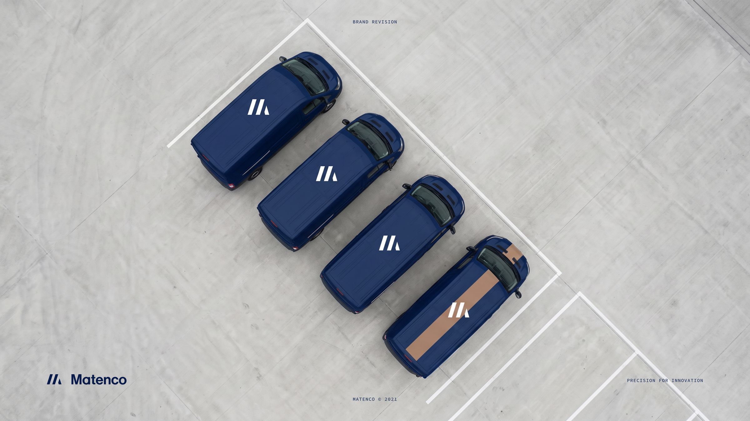
An engineering partner with a brand machined to fit
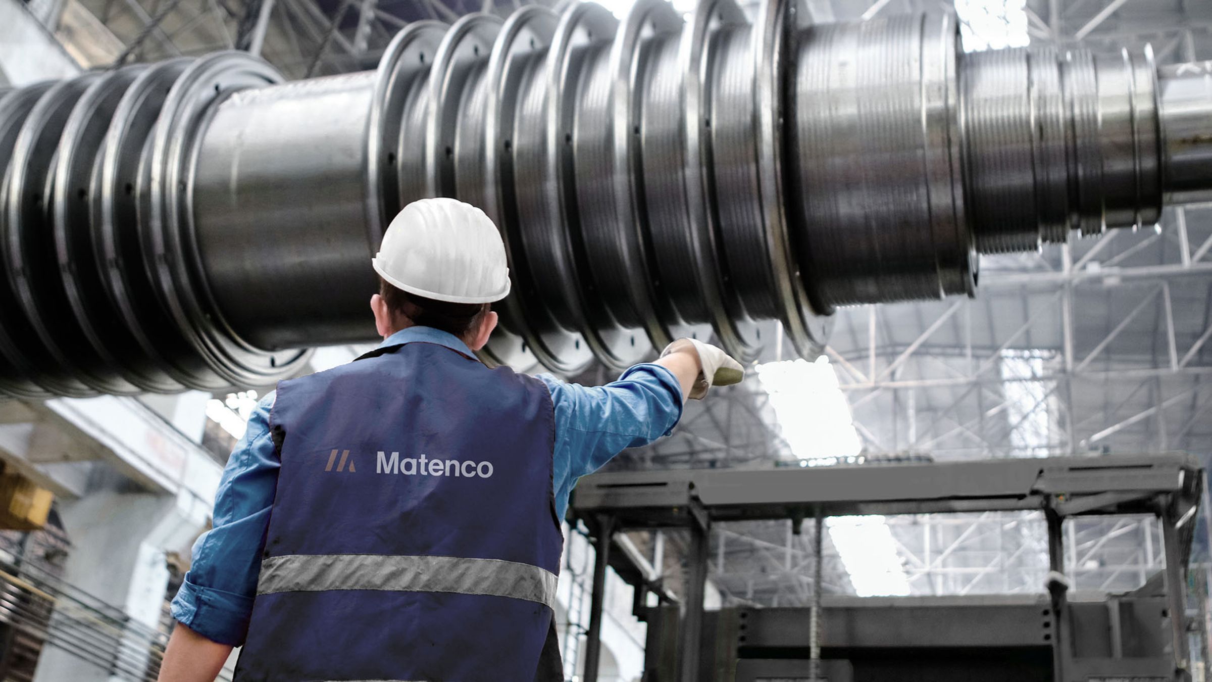
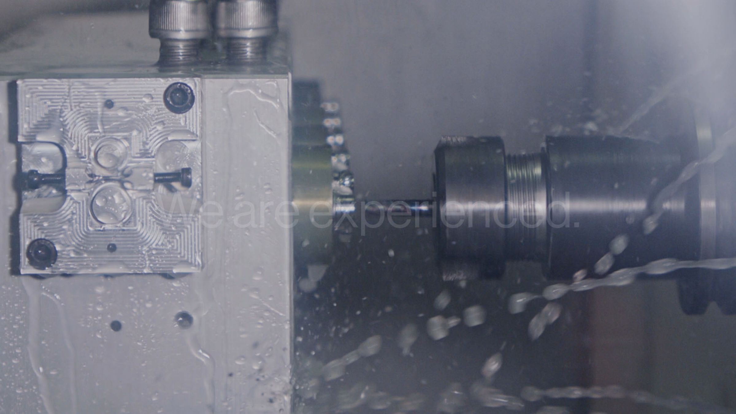
Matenco is a Swedish engineering company with more than 30 years of experience. It supplies industry in energy, hydro and water, compressed air, control systems, infrastructure and medtech.


The challenge
Engineers buy from engineers. A procurement manager choosing a supplier for a critical component looks for proof of precision long before any sales meeting. Every detail on a website or a nameplate is read as a signal of how the work itself is done.
Matenco already had a strong reputation in its field, and its blue was well known. The task was to bring the brand up to the standard of the work without losing what customers already recognised.
The opportunity
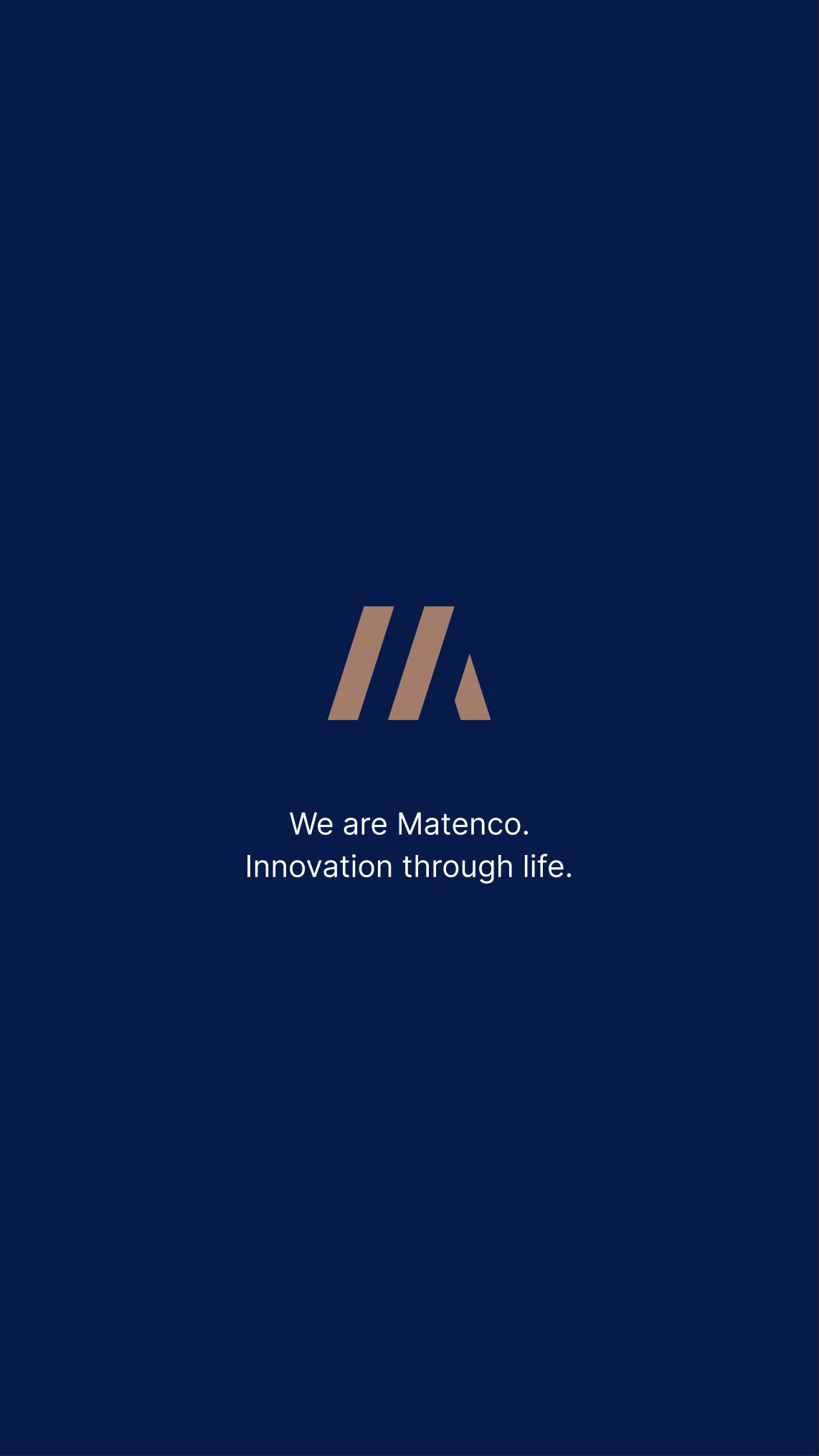
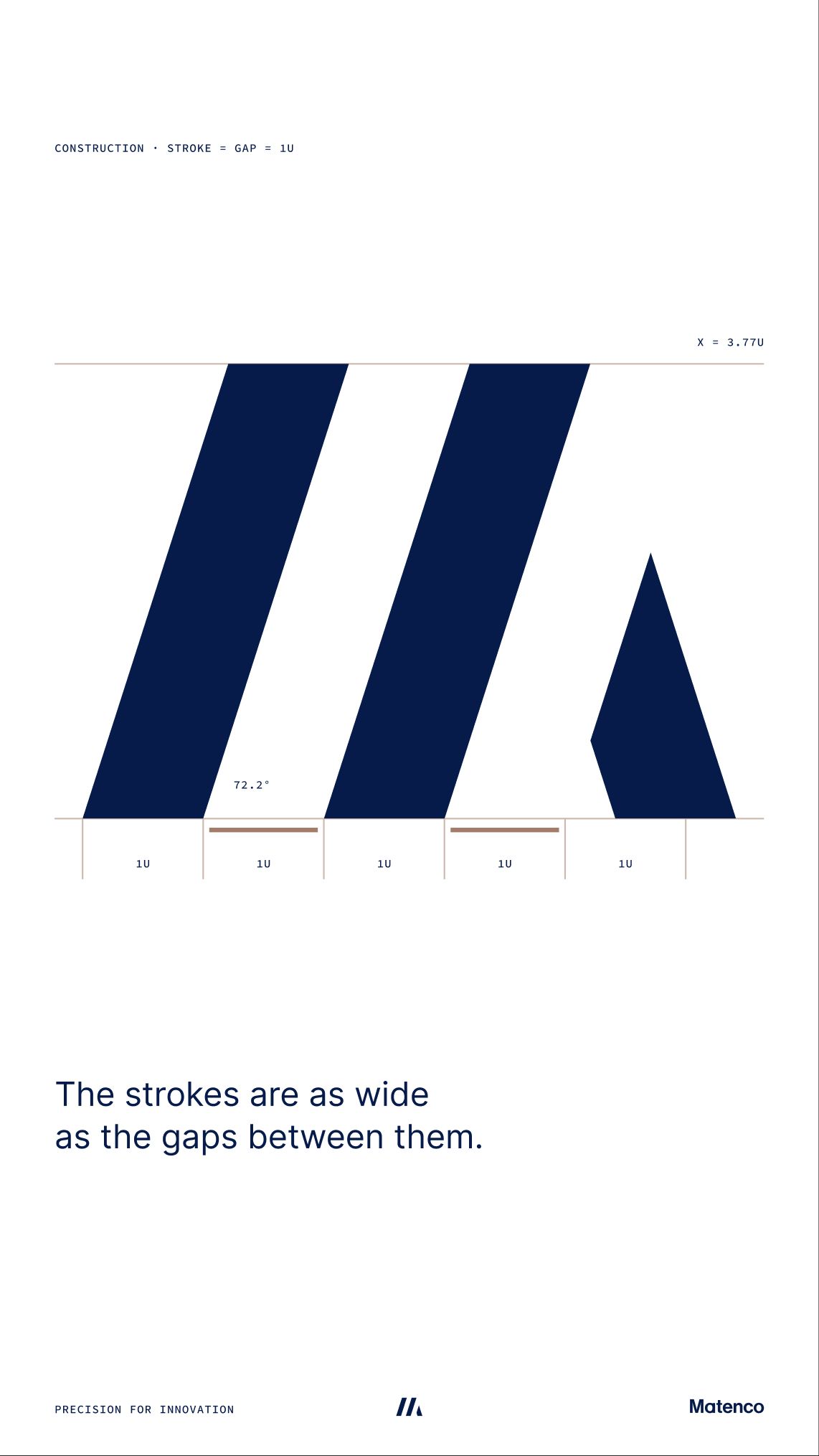
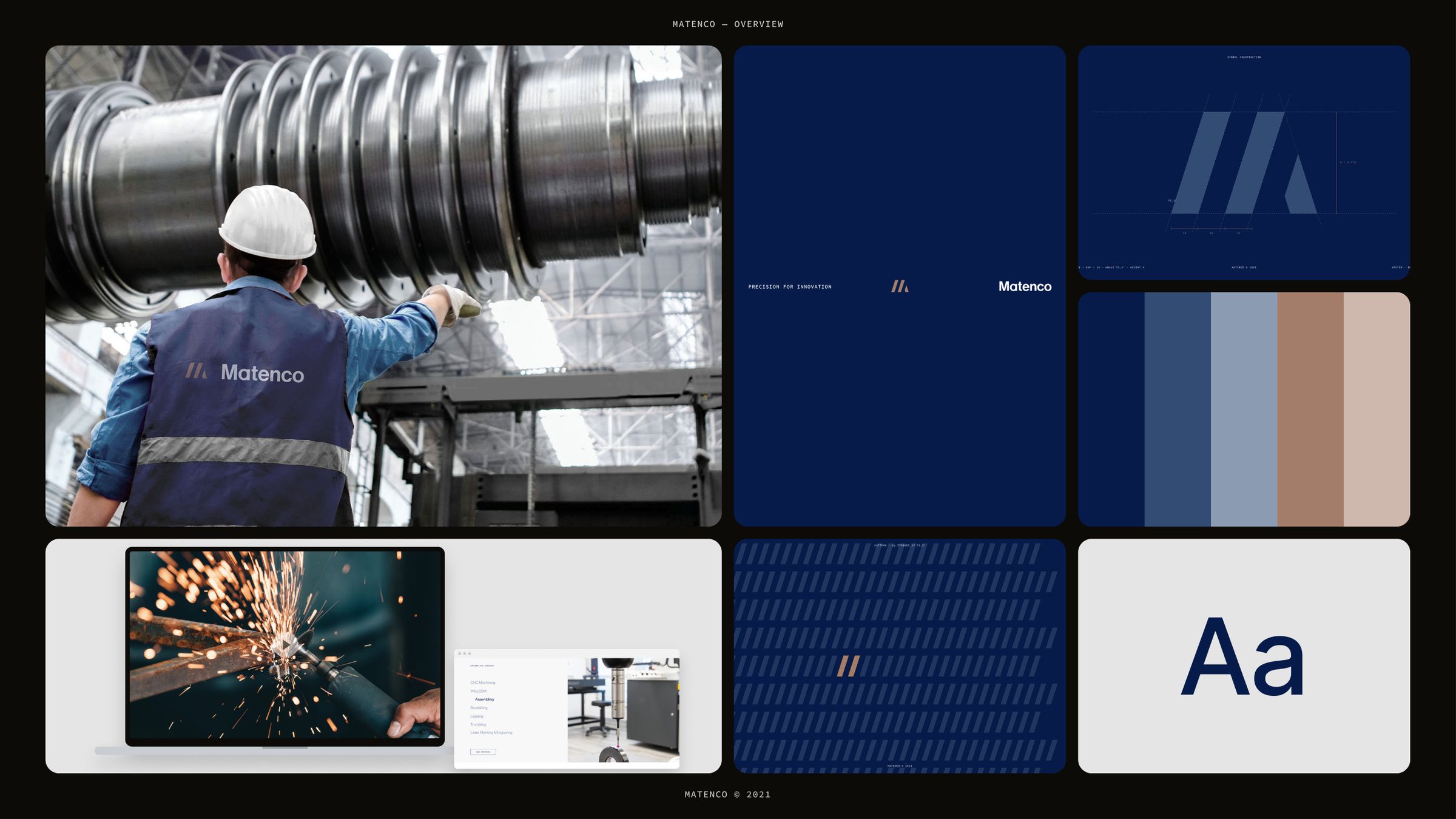
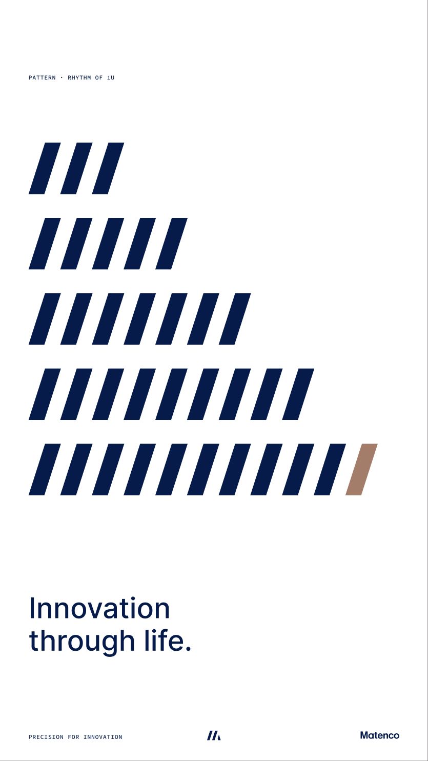
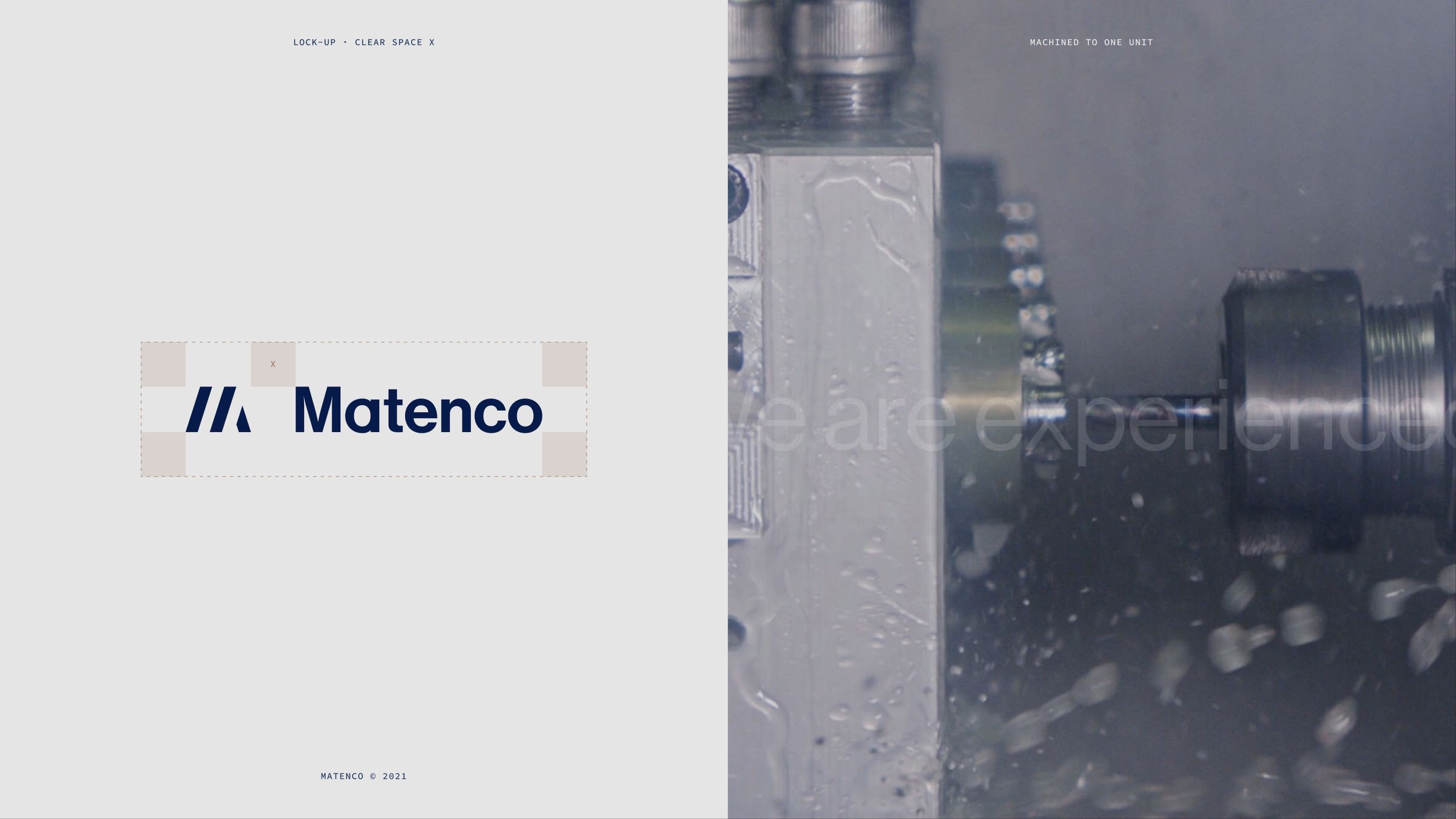
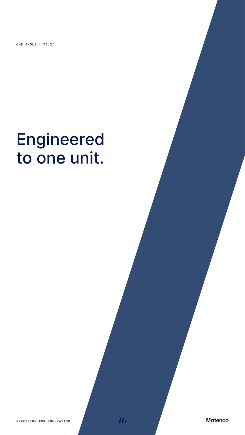
We kept what customers already knew. The blue stayed. The mark was redrawn to express precision: three machined strokes at a single angle, built on one unit, where the stroke equals the gap.
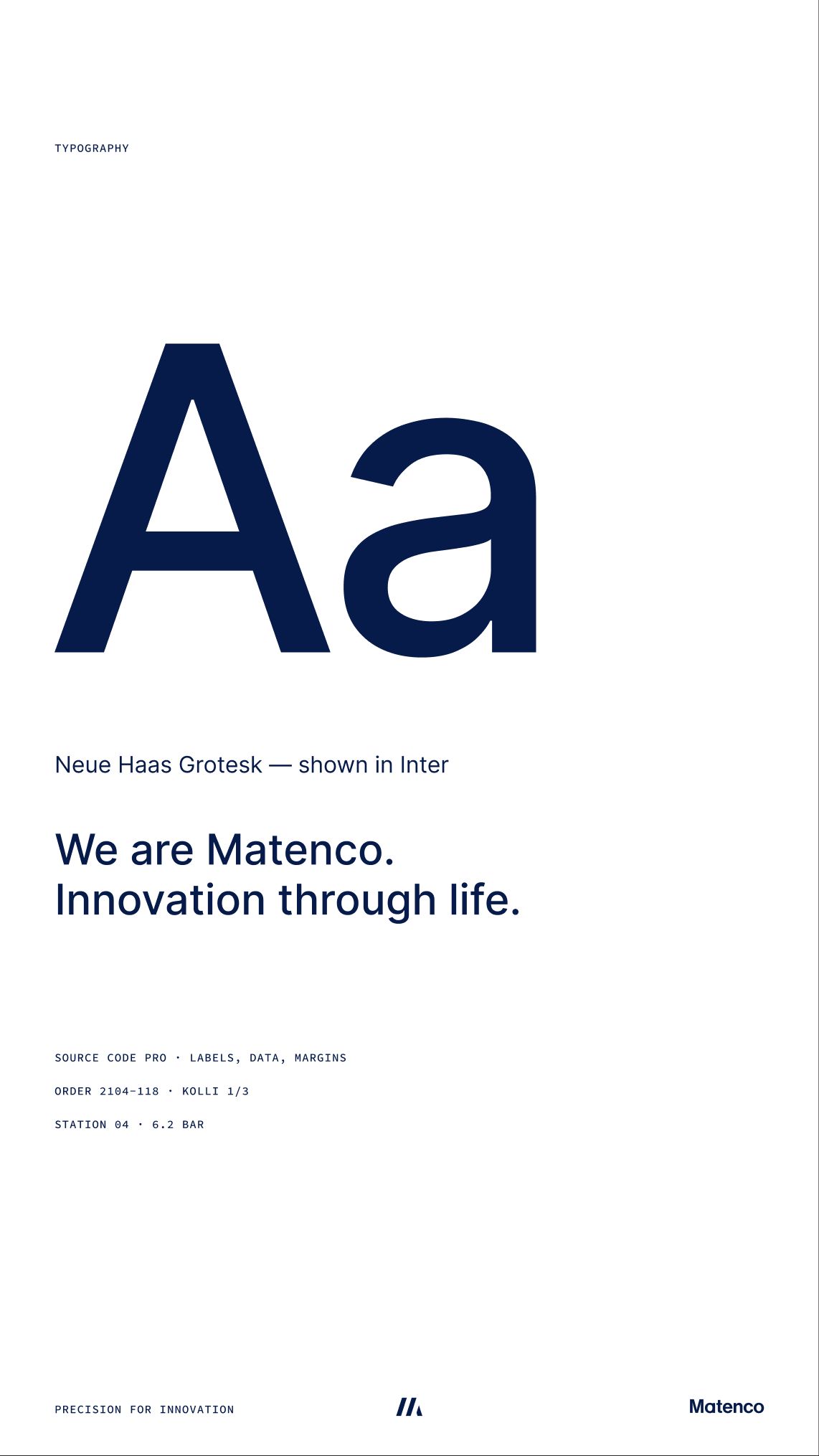
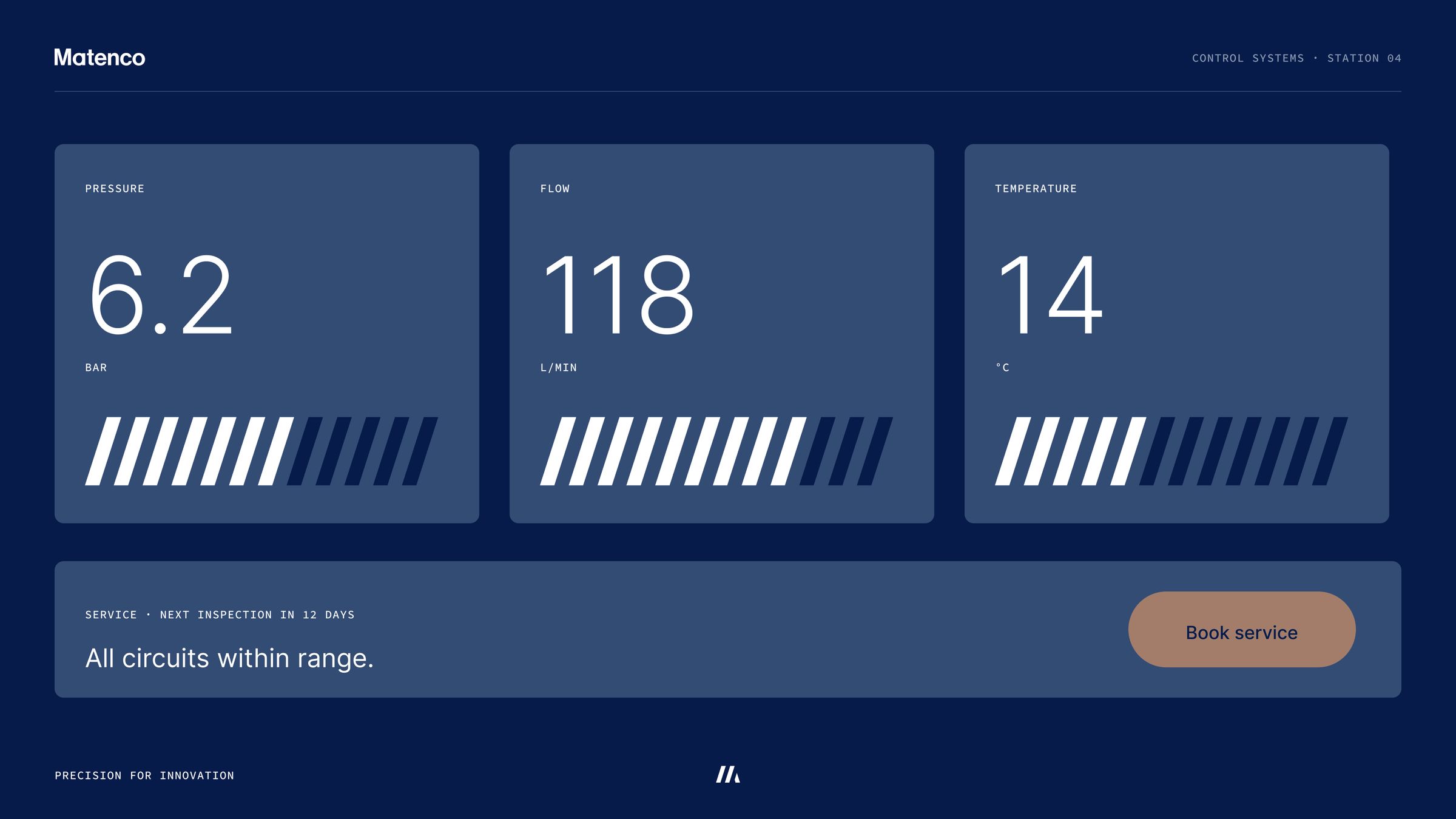
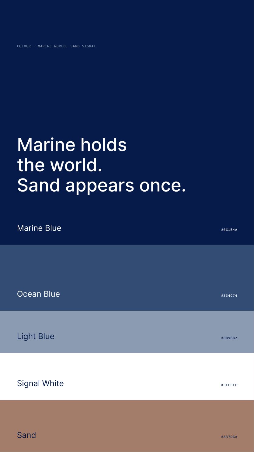
Research into the field shaped a clear hierarchy, an extended palette with obvious calls to action on the web and two typefaces that cover every need.
The result
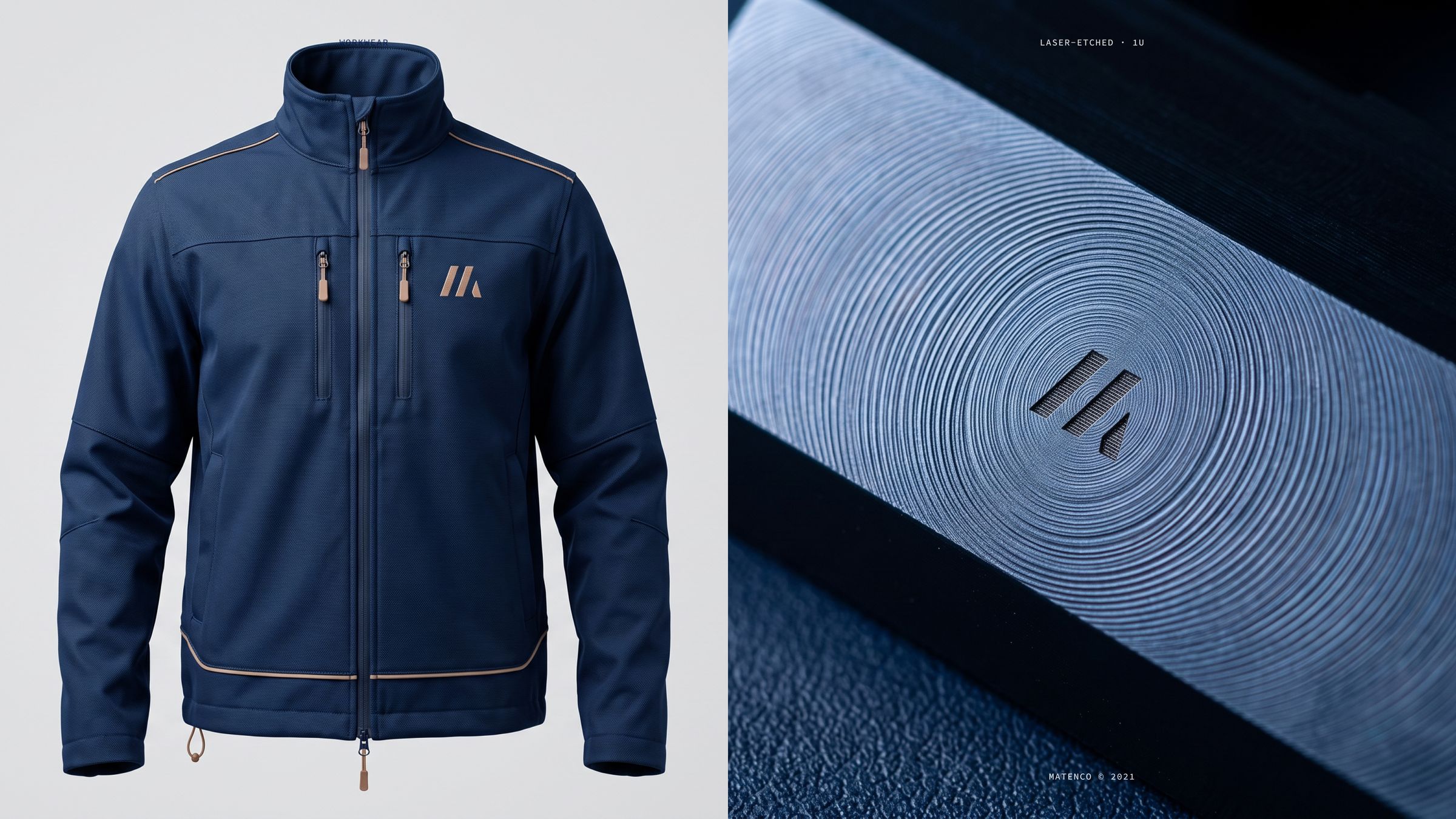
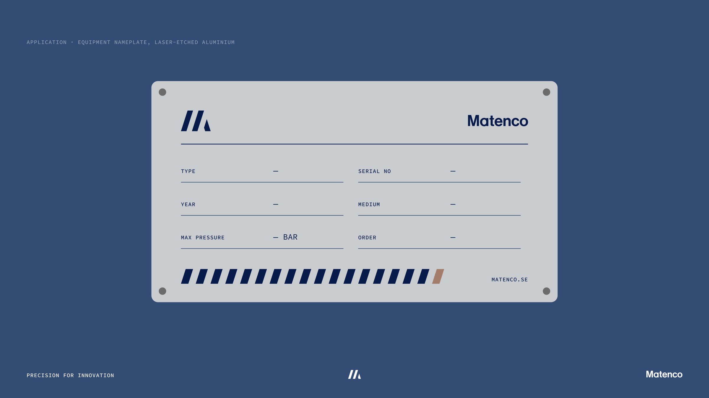
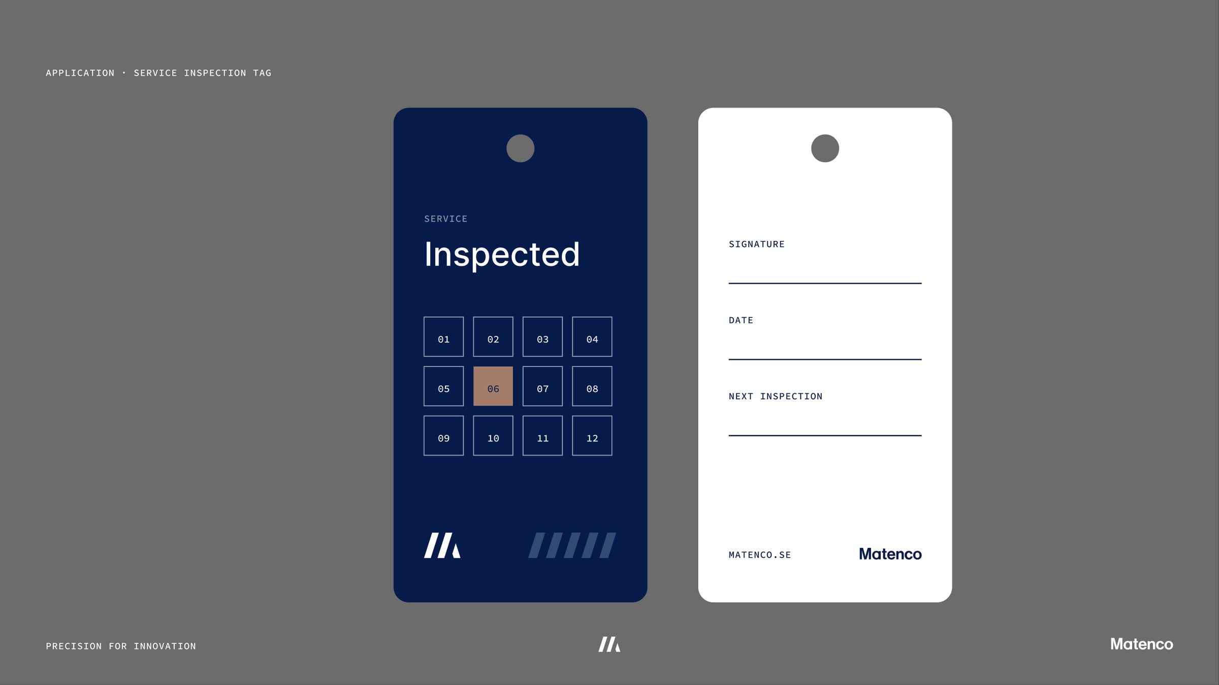
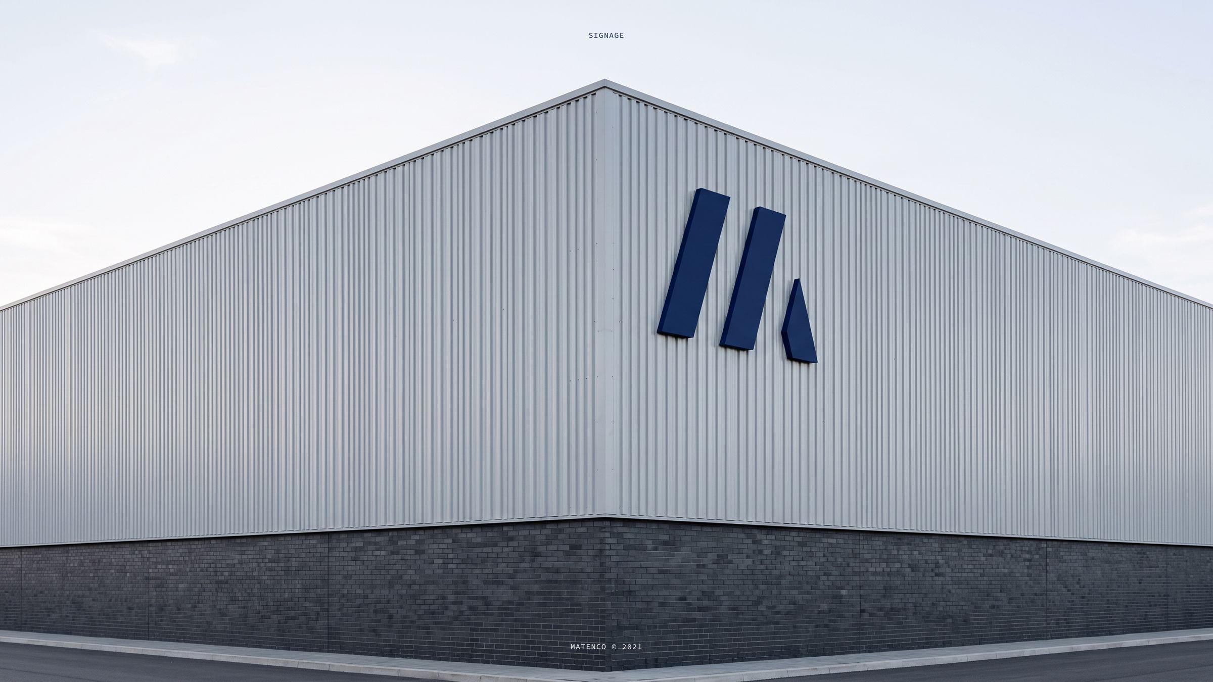
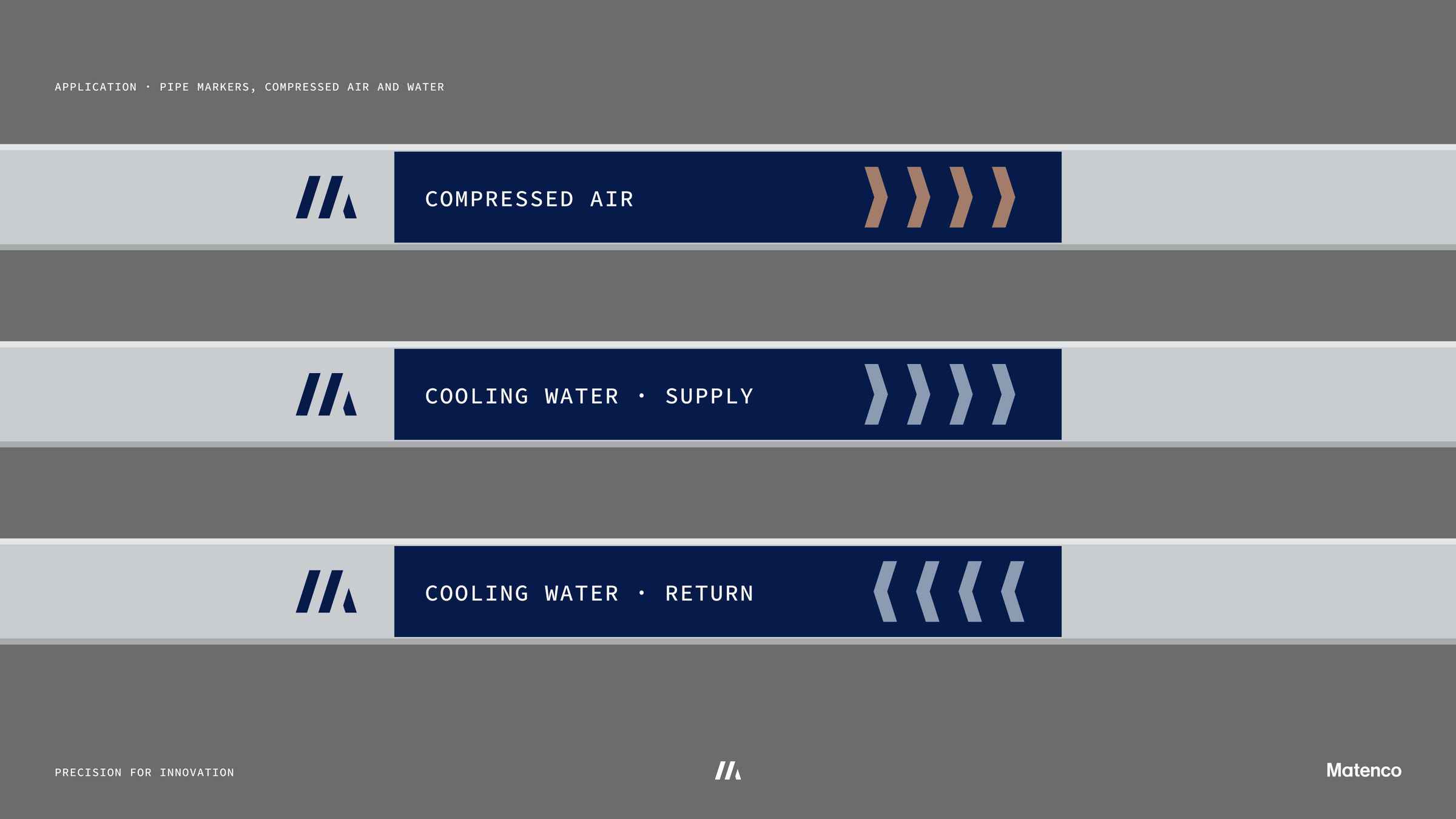
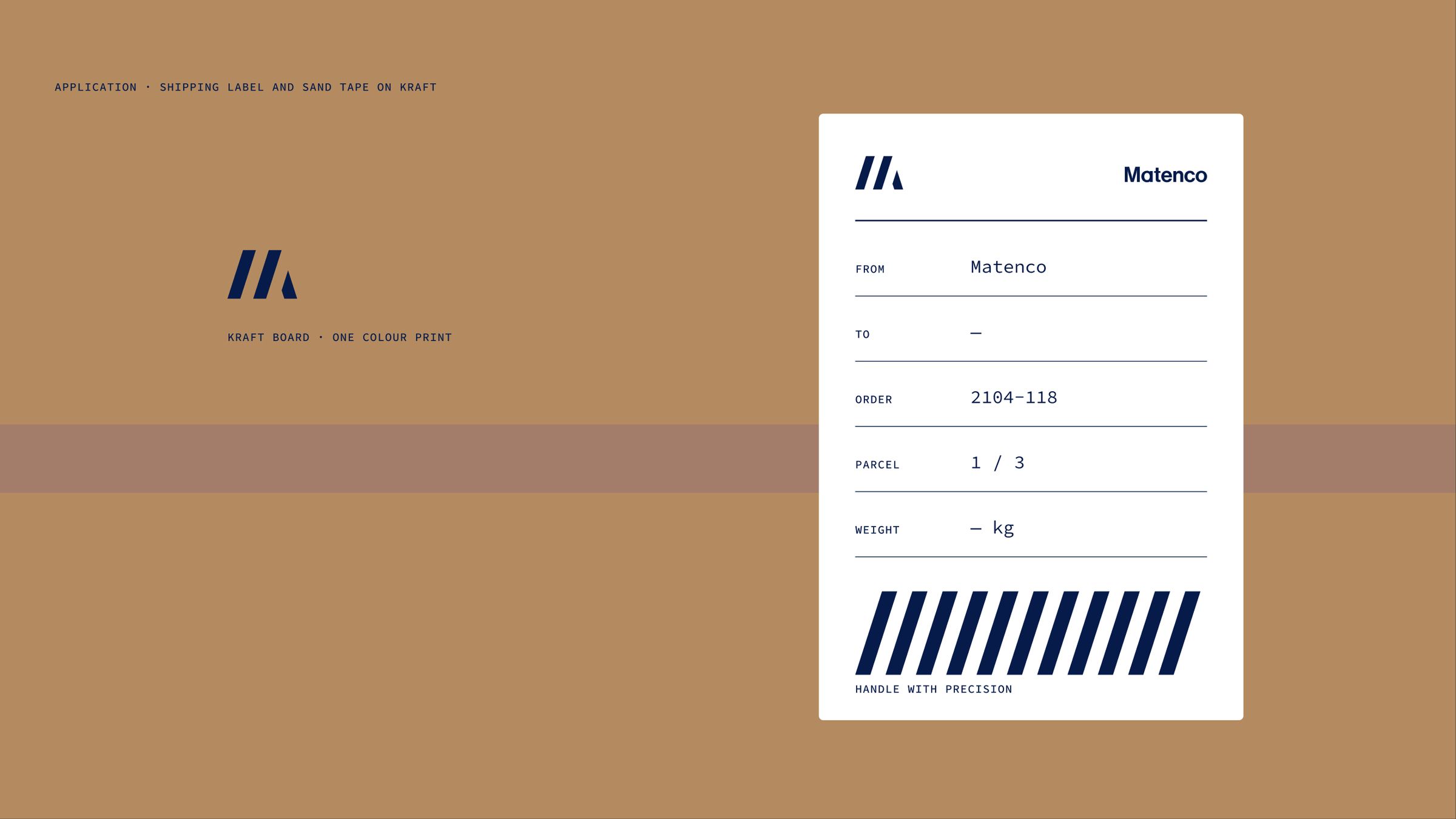
The mark scales from an exterior sign to a 16 pixel favicon. It sits naturally on equipment nameplates, inspection tags, pipe markers, control screens and shipping labels, the places where customers actually meet the brand.
A new website and a set of marketing assets give the sales team a story they can stand behind. The precision is there to see, so nobody has to claim it.